
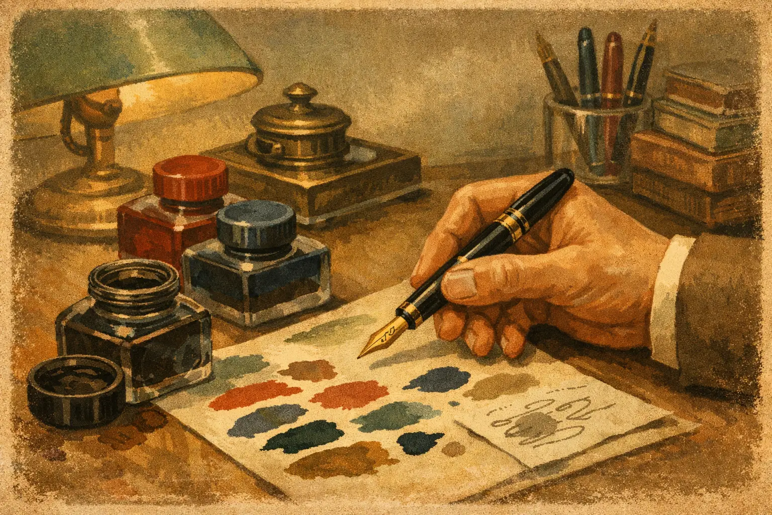
A restored fountain pen should not be treated as an ornament that occasionally signs a card. It was made to write, and the ink you put through it has a direct bearing on how it feels on the page, how easily it cleans, and how well its original materials are preserved. Knowing how to choose fountain pen ink is therefore part of owning a vintage pen properly, whether you have a reliable Parker 51, a lever-filled Conway Stewart, or a recently acquired Waterman.
The best ink is rarely the most dramatic bottle on the shelf. It is the one that suits the pen’s filling system, nib, age, and intended use, while giving you a colour and writing character you genuinely want to return to.
Start with the pen, not the colour
A modern cartridge-converter fountain pen will usually tolerate a broad range of reputable fountain pen inks. Vintage pens deserve a little more thought. Their sacs, seals, feeds and internal mechanisms may have been carefully restored, but they are often made to earlier specifications and benefit from sensible ink choices.
First, identify how your pen fills. Cartridge pens need the correct cartridge format or a compatible converter. Piston, lever, button, vacumatic and aerometric fillers generally draw ink directly from a bottle. Eyedropper-filled pens have their own requirements and can be particularly sensitive to staining, leakage and ink behaviour.
If you are unsure about a vintage pen’s filling mechanism or restoration history, begin with a conventional, easy-clean fountain pen ink in a well-behaved blue, blue-black or black. This gives you a useful baseline. Once you know the pen writes freely and cleans easily, you can experiment with more distinctive shades.
A pen with a very fine nib and a dry feed may benefit from a slightly wetter ink. A broad, generous nib can make even a wet ink look extravagant on absorbent paper. Ink and pen work as a partnership, so there is no universal ‘best’ choice.
Choose fountain pen ink by its behaviour
Colour catches the eye, but behaviour determines whether an ink earns a place in your writing case. Four qualities matter most: flow, lubrication, drying time and ease of cleaning.
Flow describes how readily ink travels from reservoir to feed and nib. A wet-flowing ink can make a hesitant pen feel smoother and more generous. It may also increase the chance of feathering or show-through on ordinary paper. A drier ink can give crisper lines and better control, particularly with a broad or flexible nib, although it may make a naturally dry pen feel less pleasant.
Lubrication is the sensation of smoothness at the nib. Some inks make a fine nib glide across the page; others feel more precise and lightly tactile. Neither is automatically better. Those who enjoy vintage gold nibs often appreciate a lubricated ink, while writers using fine accounting-style nibs may prefer a more controlled feel.
Drying time matters if you write quickly, use both sides of a page, or are left-handed. Broad nibs lay down more ink, so even a quick-drying formula can take longer to set. Try any new ink in the notebook or correspondence paper you actually use. An ink that behaves beautifully on a premium writing pad may feather badly on office paper.
Ease of cleaning is especially relevant for pens that are not used every day. A straightforward dye-based ink is usually the sensible default. It flushes out readily and makes routine maintenance less of a chore. That is a considerable advantage with vintage filling systems, where regular, gentle cleaning helps keep a restored pen enjoyable for years.
Be cautious with permanent, shimmering and highly saturated inks
Speciality inks can be very rewarding, but they bring trade-offs. Permanent, pigment and iron gall inks may offer water resistance and excellent record-keeping qualities. They can also demand more disciplined cleaning, particularly if the pen is left unused. Before using one in a valued vintage fountain pen, check that it is suitable for the pen’s materials and commit to flushing it regularly.
Shimmer inks contain particles that create a striking effect on the page. They are often better reserved for modern pens designed for easy disassembly, or for pens used and cleaned frequently. Fine feeds and vintage mechanisms are not the ideal place to discover that a glittering ink has settled during several months in a drawer.
Highly saturated inks can produce rich, memorable colour, but some are more prone to staining converters, sections or ink windows. Staining is usually cosmetic rather than harmful, yet it is worth considering if originality and presentation matter to you. A transparent demonstrator is a more forgiving place for experimental colours than a scarce celluloid pen.
None of this means collectors must write only in blue-black. It means matching the ink’s demands to the pen. A dependable daily writer can accommodate more adventure than a rare lever-filler kept for occasional correspondence.
Select a colour for the work you do
Traditional blue and blue-black remain popular for good reason. They are legible, dignified and suitable for letters, notes and everyday writing. Black offers a clean, formal line, though some black inks can look rather grey in a fine nib or very dense in a broad one.
For personal correspondence, burgundy, sepia, forest green and restrained purple shades suit many vintage pens particularly well. They echo the warmth of aged resin, chased hard rubber and gold trim without turning the page into a novelty. A teal, orange or bright violet can be delightful for journalling, annotations or headings, but it may not be the practical choice for every document.
Consider the nib as well as the colour. Fine nibs often make pale inks appear faint, while a broad or italic nib reveals shading and variation that may be invisible from a narrow point. If you have bought a pen for its expressive stub or flexible nib, choose an ink with enough depth to show its character.
Paper is part of the ink decision
Many supposed ink problems are paper problems. Cheap, absorbent paper can cause feathering, bleed-through and a broad, woolly line even with an otherwise excellent ink. Smooth, fountain-pen-friendly paper typically gives cleaner edges, more shading and a slower drying time.
If your everyday notebook is absorbent, favour a relatively dry, fast-setting ink and a finer nib. If you write letters on quality laid or smooth stationery, you can enjoy wetter inks and broader points with fewer compromises. For a vintage pen used at work, it is wise to test the full combination: pen, ink and the paper supplied by your employer or preferred notebook maker.
This is also why ink samples can be useful. A whole bottle is excellent value once you know an ink suits you, but a small trial lets you assess its colour, flow and cleaning behaviour before committing. Test with a few pages of real writing rather than a single swatch.
Build a sensible ink routine for vintage pens
The safest routine is uncomplicated. Use an ink made specifically for fountain pens, keep the bottle clean, avoid mixing different inks inside a pen, and do not leave a pen unused for long periods with ink in it. If you are changing colour, flush with cool clean water until it runs clear, then allow the pen to dry before refilling where practical.
Do not use India ink, calligraphy dip-pen ink, drawing ink or any product not expressly intended for fountain pens. These can contain binders, shellac or particles that obstruct a feed and create an unnecessary repair issue. Vintage pens are durable objects, but they are precision instruments rather than disposable stationery.
For a pen in regular use, a periodic flush is usually enough. For a pen being stored, empty and clean it first. If ink flow changes, resist the temptation to force the mechanism or apply home remedies. A careful clean solves many issues; a specialist can advise where it does not.
Let the pen guide your collection
A small, well-chosen group of inks is more useful than a shelf of bottles you hesitate to open. Keep one dependable blue or blue-black for routine writing, one black if you need it, and a few colours that make you want to write a proper letter. As your collection develops, you may find that a particular Pelikan prefers a slightly drier ink, while a flexible Waterman comes alive with something wetter and more shaded.
At Heritage Collectables, restored pens are selected to be appreciated in the hand as well as in the cabinet. Give each one an ink that respects its mechanism and reveals its nib at its best. The first fill need not be the final verdict: write a few pages, clean it carefully, and let the pen tell you what it prefers.